Charting: Bar Chart
The bar chart is one of the most commonly used stock charts. The reason for this is that it contains a wealth of information about price action while keeping the chart uncluttered and easy to read. This is what two bars look like.
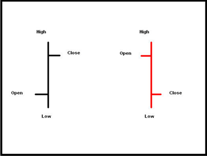
OHLC Bars (Open High Low Close)
Note a few of the features of this type of chart. The extreme ends of the vertical line represent the price highs and lows of the day.
The left side of the line has a shelf sticking out. This shelf on the left side represents the opening price of the security. The ride side of the line has another shelf sticking out. This right side shelf represents the closing value of the security.
If the stock price closes higher than the open, the bar will be black. If the stock drops during the day and closes lower than the opening, the bar will be red. Note that only some charts will differentiate the colors red and black. Other programs will have all the bars as one color regardless of opening and closing prices. Other programs will decide upon their own custom color scheme.
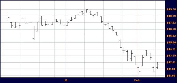
Woodside (WPL) with OHLC Bars
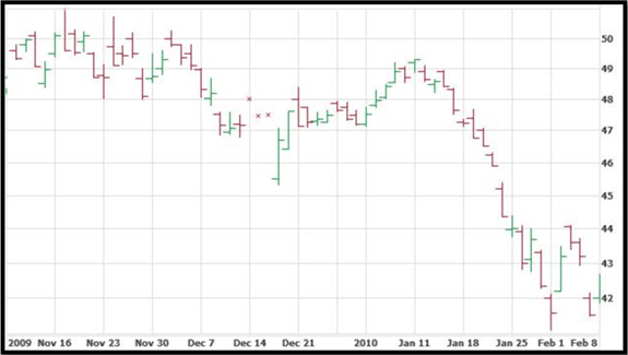
Another OHLC Chart for WPL with Colored Bars
Variations on the Chart
One variation of this chart to watch out for is the HLC. Some prefer to have only the daily range and the closing values while omitting the opening price. This is typically used for trading styles that put little emphasis on opening prices and almost all the weight on the closing value.
Such a bar would always have the right and left ‘shelves’ at exactly the same value, and it would represent closing price only. Or the left shelf that is usually reserved for opening prices may not be present at all.
It is good for a person interested in charting to take a few minutes and analyze each bar on one of the graphs above. Try to determine the opening and closing price for a day, as well as the daily highs and lows.
A popular alternative to the OHLC bar chart is the candlestick chart. With a bit more color and some larger shapes we can quickly determine market price action for later analysis.