Candlestick charts along with the bar chart are the most popular charts for share trading. This is because the charts provide a wealth of information including the open, high, low and closing prices. Another reason why they are so popular is because they are very easy to read and interpret.
Analyzing charts with candlesticks is by no means a new method. In the 18th century, a Japanese businessman by the name of Munehisa Homma (sometimes referred to as Sakata) developed this way of plotting movements on the price of rice contracts. Most would consider him to be the Grandfather of candlestick charting.
Candlestick Charting Explained
How to Read a Candlestick Body
Although they may look daunting, reading a candlestick is actually quite simple once you are familiar with the color schemes and appearance.
- If the body is white, the price rose for the period of time.
- If the body is black, the price dropped for that time period.
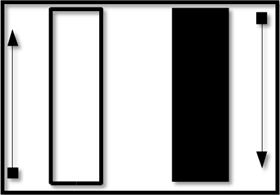
With the white candlestick, the price opened at the bottom of the bar, rose during the day, and had a closing value at the top of the bar. This is considered bullish.
On the black candlestick, the price opened at the top of the bar and fell for the day. The closing price is at the bottom of the bar. This is bearish.
What are Candlestick Wicks?
At the top and bottom of candlestick bodies you will often find lines shooting up and down. These are called wicks or shadows. The wick or shadow is showing prices that the stock traded in, but it is not between the opening and the closing price.
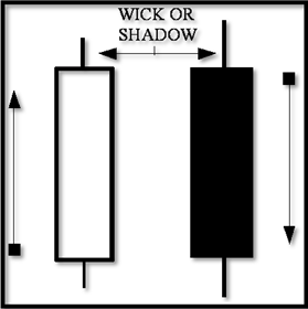
Some describe the wicks as the extreme daily range. For instance, if the stock opened at 10 dollars and closed at 12 dollars, a white body candle would be present between 10 and 12 dollars. If the trading range was between 9 dollars and 13 dollars (even though the open and close was 10 and 12), the wicks or shadow would be drawn to represent that.
Candles Without Bodies?
Sometimes, you will come across a candlestick formation that has no body. The candlestick chart pattern will look like a cross. This is called a doji.
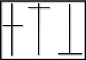
A doji is formed when the stock opens and closes at the same price while having a trading range. It often depicts the indecision of the investors.
Color Scheme Variations
Depending on the charting service provider, red candlesticks will be used to depict dropping prices instead of the color black.
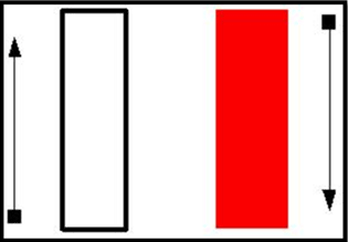
While this may seem like a moot point, it is important to recognize since other odd (but infrequent) candlesticks will appear on the chart. For instance, if the two colors are white and red for up and down days, what does a black candlestick mean? As well, how would you read a hollow red candlestick?
Black Candlesticks and Hollow Red Candlesticks
The chart below uses white candlesticks to show prices closing up for the period, and red for prices closing lower. Notice the black and hollow red candlesticks present. What do they mean?
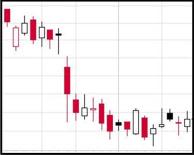
- Black Candlestick: The price dropped for the period, but the closing value is still higher than yesterday’s close. While dropping prices during the day (or period) are bearish, it must be taken into context that the price is still up between days (or periods). You will often see this when prices gap-up in the morning and sell during the day.
- Hollow Red Candlestick: This occurs when the price climbs for the day, but the closing price is still below yesterday’s close. Again, you might see this if the stock gaps downward in the morning and climbs during the day, although not as high as yesterday.
These two different candlestick formations highlight a mixed signal that is both bearish and bullish at the same time.
Comparing the Charts
Examining the line chart below WPL shows the basic trading pattern over 10 days.
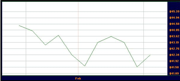
Much extra information is available to the person who uses candlestick charts.
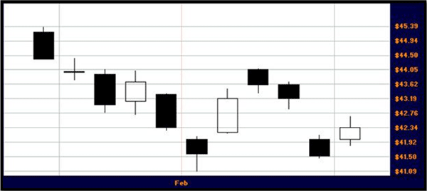
Some of the details that can be gleaned on a quick glance are how the prices gapped down on the second to last candlestick.
Also, the 6th candlestick has a very long lower wick showing that while prices traded much lower during the day, there was some support to keep prices up. The next two days of price action may have been predicted based on that one clue.
Long white candles show a strong sentiment, while the short body candles point to a consolidation.
By carefully reading candlestick diagrams, much important information can be had.