The concept of a trend line is a simple one: connect two points together with a line. Correctly drawing it requires a bit more skill. The reason traders use a trendline is to plot a support and resistance level for stocks in a trend. For instance, if a stock is trending upwards, the chartist will be interested in how fast the stock is moving up over time. He can see this if he properly draws a trendline.
Rules to Drawing a Trend Line for a Rising Stock
Because trend lines drawn on upwards and downwards trending stocks are slightly different, we will discuss them one at a time.
Below are the rules for drawing trendlines on stocks trending up.
- Use a logarithmic scale
- Find the lowest low.
- Find the highest high.
- Take the highest high and trace backwards to find the highest minor low before it.
- Draw a line connecting the lowest low to the chosen minor low without passing through any price data.
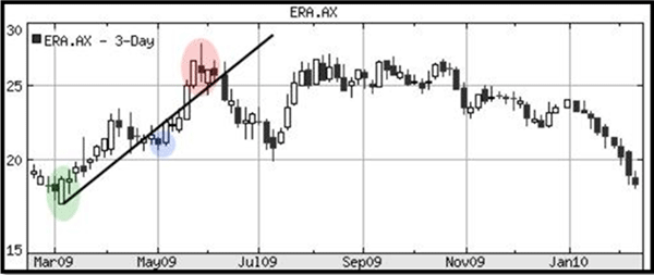
We will test these rules on the following stock chart ERA (Energy Resources)
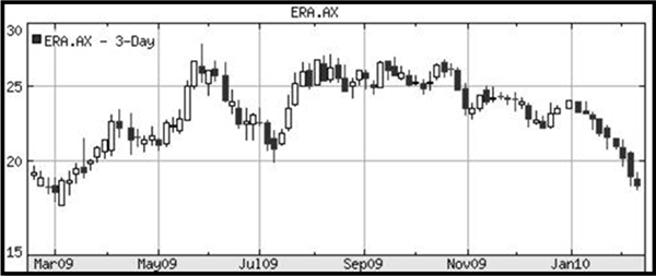
From March to June 2009 the stock was in an uptrend. The prices whipsawed for a few months and began a downtrend from October 2009 until the chart finishes in February 2010.
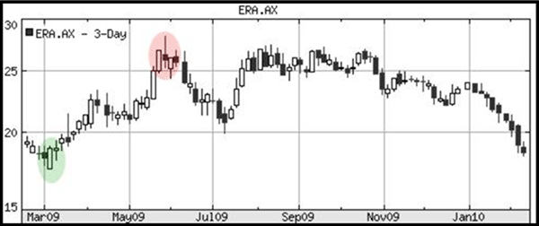
Because we are discussing an uptrend first, we will dissect March to June 2009.
Steps one and two dictate that I need to find the lowest low and highest high. I have done so and colored them green and red respectively.
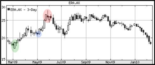
My next step requires that I trace backwards from the red circle or the highest high, and mark out the bottom of the dip. I have colored this portion blue.
Now I am ready to draw my trendline. It is important that the trendline for an up trending stock is always beneath the price. It is a support propping up the stock prices. I will connect the green and blue portions making sure to draw on the bottom of the candlesticks.
This is how the trendline looks.
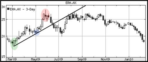
The stock bounced once off the trendline in May 2009. The price rose and crashed through the trendline in late June 2009. Interestingly, the price rose to touch the underside of the trendline in July and August of 2009. The trendline that created support will often become a resistance if the trend changes. More of this will be discussed later.
A rule of thumb that should be followed: try to pierce prices as few times as possible with your trendline. The chart below would be incorrect since the line goes right through the price values in May with little regard.
Rules to Drawing a Trendline for a Falling Stock
- Find the highest high (green)
- Find the lowest low (red)
- Trace backwards from the lowest low to find a minor high just preceding it (blue)
- Draw a trendline between the green and the red. Make sure the line is above the prices for a falling stock in a downtrend.
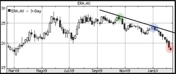
The prices are pulling away fast from my trendline. The prices have fallen drastically in January. If the price continues to drop we will need to draw a new trendline starting at the beginning of January with a much steeper slope. On the other hand, it is altogether possible that the prices will rise to touch the trendline drawn at some future date.
Best Fit Trendlines
Sometimes it is quite difficult to perfectly fit the trendline without piercing price data as the chart below depicts. The trendline is underneath the correct low point in Sept 2009, and under the right spot in mid-December. But the prices have compromised our trendline twice. What can be done?
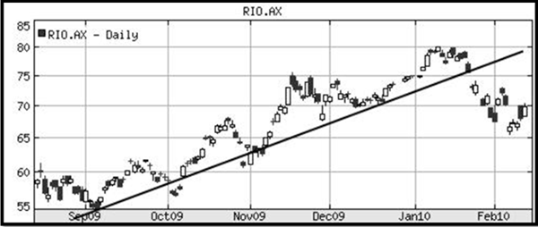
If the trendline pierces the data very few times and the breach is shallow, you can continue to use the trendline. Nothing in this world will be a perfect fit.
But if the trendline pierces the data on almost every price bounce, or at least 1/3rd the time, consider moving the trendline somewhat. In this instance, we can move the lowest point from September 2009 to October 2009 (a more recent low).
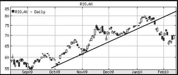
This simple adjustment has made a much more accurate fit for our trendline analysis and we can confidently use it. Just be careful not to move your trendline around with bias making it fit your sentiment. Only very minor adjustments are allowed.
Trend Lines on Point & Figure (P&F) Charts
Because of the nature of Point and Figure charts, trendlines will be drawn at 45 degree angles.
- If it is an uptrend, start at the lowest column of O’s and draw a 45 degree angle up.
- If the trend is a downward one, start at the top of the highest row of X’s and draw a 45 degree angle downward.
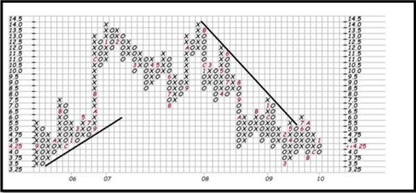
As you can see, drawing trendlines is quite simple on the P&F chart. In fact, many online charting sites will even draw the lines on for you.