Charting: Line Chart
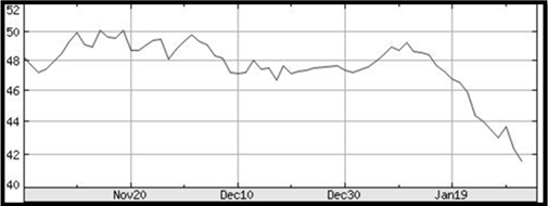
In the world of charting, the line chart is the most basic and easy to read. Only the closing price is plotted on this style of chart. The closing prices are plotted over time and connected together with a line, hence the name line chart.
The stock we are going to analyze is Woodside (WPL) on the ASX. Below is a list of historical closing prices over a few weeks of time. Note that all values except for closing prices have been slightly blurred since these are not taken into account with line charts.
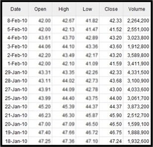
Next we show the graphical representation of those closing prices over time. You are able to correlate the price dive from just under $47 on Jan.19th to just over $42 on Feb.8th between the historical data and the graphical chart.
Why Use a Line Chart?
Line charts can be used by investors just learning to use charts, or by someone who only wants a passing glance at the chart without the extra details. As well, some securities on some exchanges might only list the closing values making the line chart desirable.
Because of its simplicity and ease of use, there is little more to be said on line charts. Next we will discuss one of the most commonly used charts, the bar chart, or also called the OHLC (Open High Low Close).