Before the age of computers, charting was mostly performed by hand. This made certain types of charts very cumbersome indeed. One style of chart was very easy to draw by simply using graph paper and with X’s and O’s. This was called the Point and Figure chart.
While computer charts can easily create flashy bar charts or candlestick charts, there are some distinct advantages to the Point and Figure charts.
- Small price movements are not plotted on the graph. This makes it easier to chart and less distraction for the technical analyst.
- Patterns may be more readily apparent since time is not graphed
- Plotting support and resistance is quite simple
- Trendlines are easy to see
Reading Point and Figure Charts
A typical Point and Figure chart (P&F) might look similar to the chart below.
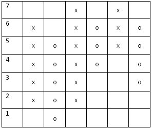
The y axis is used for price (1,2,3,4,etc.). In this extreme example, each box is equivalent to one dollar of share price. The x axis does not represent time. This chart is timeless and new columns are filled with X’s and O’s only when the price makes a significant reversal.
- An column of X’s means the price is rising
- A column of O’s means the price is falling
In the above fictional chart, the price rose from 2 dollars to 6 dollars. Then it fell and was plotted from 5 dollars down to one dollar. Then it reversed again and rocketed from 2 dollars to 7 dollars as can be seen by in the third column full of X’s.
Comparison of Line Chart vs. P&F Chart
Next, we will compare the line chart next to the P&F chart to visually see the differences. The line chart below is for the ASX 200 index from the end of October 2009 until February 11th, 2010.
Line Chart for ASX 200
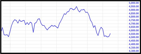
One the line chart, each vertical line on the y axis represents two weeks of time. Each horizontal line on the x axis represents 50 points on the index.
P&F Chart for ASX 200
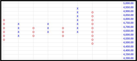
This Point and Figure chart covers the same amount of time as the line chart above. While the horizontal lines on the x axis represents 50 points on both the line chart and the P&F chart, the y axis is much different.
Each vertical line does not represent time or weeks. Instead it represents a reversal in price. One of the very common methods for Point and Figure charting is to plot price reversals of three boxes or greater. That means if the index changed direction 150 points or greater (three boxes worth since each box is 50 points), a new column of X’s or O’s would be drawn. This would be independent of time.
Important Rule - Put this is a box with purple - look at examples
Most P&F charts will plot a new column of X’s or O’s if the price reverses direction three boxes or more. Although custom charts may use a different number than three.
If the index shot up 200 points one week, a column of X’s would depict this. Imagine the price reversed and fell 200 points the next week. This would also be plotted with a new column of O’s. But if the index consolidated and took three months to rise 150 points, this would be plotted by the next column of X’s. Each column represents significant price reversals and does not depend on time.
How to Determine Time on a P&F Chart
Not plotting time in a linear fashion does not mean the chart does not have a time reference. Notice in the chart below that numbers and letters mixed in.
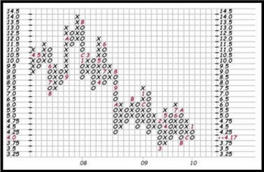
To gauge a timeline for the P&F chart, a code system is used as follows:
In certain columns of the P&F chart you might see multiple symbols such as B,C,1. This means that the column was formed in the months of November, December, and January.
This concludes the lesson on how to properly read a Point and Figure chart. In following lessons we will discover how to draw trendlines and find support and resistance on such charts.
| Jan |
Feb |
Mar |
Apr |
May |
Jun |
Jul |
Aug |
Sep |
Oct |
Nov |
Dec |
| 1 |
2 |
3 |
4 |
5 |
6 |
7 |
8 |
9 |
A |
B |
C |